Nick Lim Boot the desktop →

Product Design Lead · Singapore

I redesign how
design gets done.

Ten years across agency, edtech, HR tech, and insurtech — the last four in Southeast Asian insurance, most recently leading design across two markets at Oona Insurance.

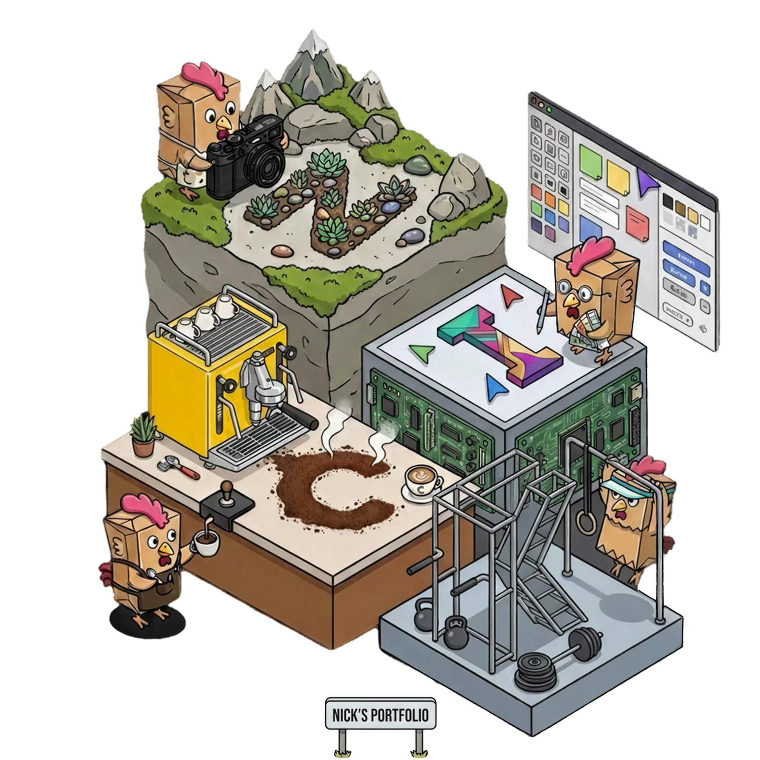
The desktop is the interactive version — built by hand, chicken included.

Illustrated portrait of Nick Lim
60%engineering overhead reduced
300%more feature deployment velocity
3GCash partner awards, March 2026
2markets — Indonesia & Philippines

Selected work

Oona Insurance · Group Design Lead · 2024–2026 · Indonesia + Philippines

The 60/300 story

I rebuilt how design and engineering shipped together at Oona: 60% less engineering overhead, 300% more feature deployment velocity — with a lean team serving two countries. It's the work I'm most proud of, and it barely has a screenshot to its name, which is exactly the point.

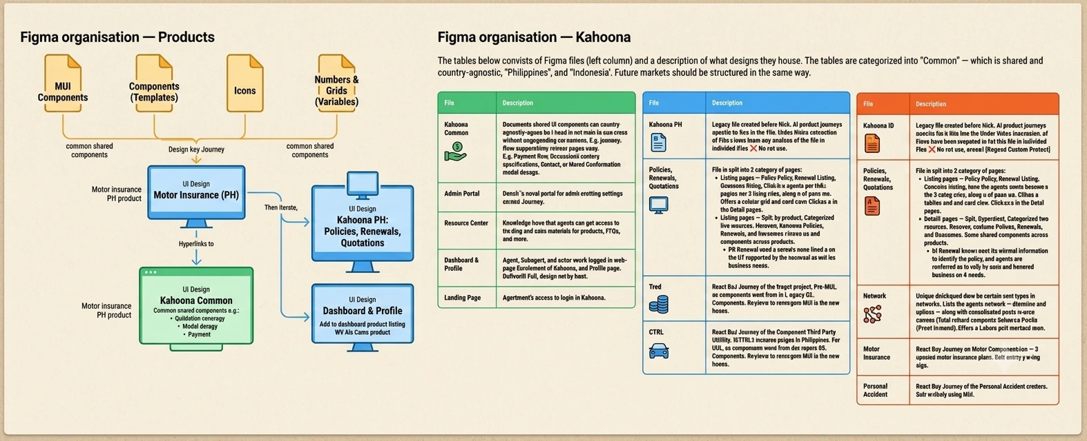
14+ files, every edit cascades MUI base Components Working files Common files one-way trickle, nothing criss-crosses
The architecture change, schematically. The desktop version has the interactive graph.
60%engineering overhead reduced
300%feature deployment velocity
4 → 2design headcount, output maintained
Read the full case study

The mess I inherited

Our design system lived in more than fourteen Figma files, each publishing its own slice — logos in one, colors in another, fonts, effects, grids, forms, each in their own. Changing something in file 01 cascaded into 02, 03, 04, and 14; each had to receive the update, then re-publish to every working file. A criss-cross of dependencies that turned a logo tweak into an afternoon. For a lean team shipping fast across Indonesia and the Philippines, this was an architecture designed to slow us down.

Change one: architecture

I restructured the entire system around Atomic Design, with one direction of flow: the MUI base publishes atoms, molecules, and organisms into a Components file, and Components publishes into working files. Updates trickle down, and nothing criss-crosses. Then the second layer: Common files — DTC Common and Kahoona Common house everything market-agnostic, documented once rather than re-drawn by different designers and slowly drifting apart.

Change two: a shared language

I brought MUI into every revamp and new build, and this was the game-changing leverage. Design and frontend suddenly spoke the same words — a component spec could be one sentence, "This is an MUI Autocomplete field with multi-select and search", and nothing more. My favorite proof: one of our Product Managers used to write component interaction behavior into every user story. After MUI came in, she stopped — simply because she didn't need to anymore.

Change three: never design one extra pixel

Figma files exist for developers, not for decoration — so we drew unique states only. Error states drawn once; a twenty-field form gets one full-frame reference, and every variant after that is just the form. The same rule ended wireflows: our Philippines motor Policyholder form explodes combinatorially — Individual or Corporate, documents now or later, leased, assigned — and no arrangement of arrows survives that. So instead, a matrix: one reference frame, then a table of scenario deltas. Logic goes into user stories, flows into flow diagrams, and Figma is design specification reference.

Change four: content sheets

Designers fill Figma with placeholder copy, stakeholders review it as if it's real, and the churn hits three times: review, QA, UAT. So we stopped pretending. Once a flow locks, the designer prepares a content sheet — a plain spreadsheet the copy owners fill in, with two small columns doing the real work: char count and char limit. Copywriters write long because more words sell; legal writes long because more words cover risk; the designer sets the limit, and the limit is part of the brief.

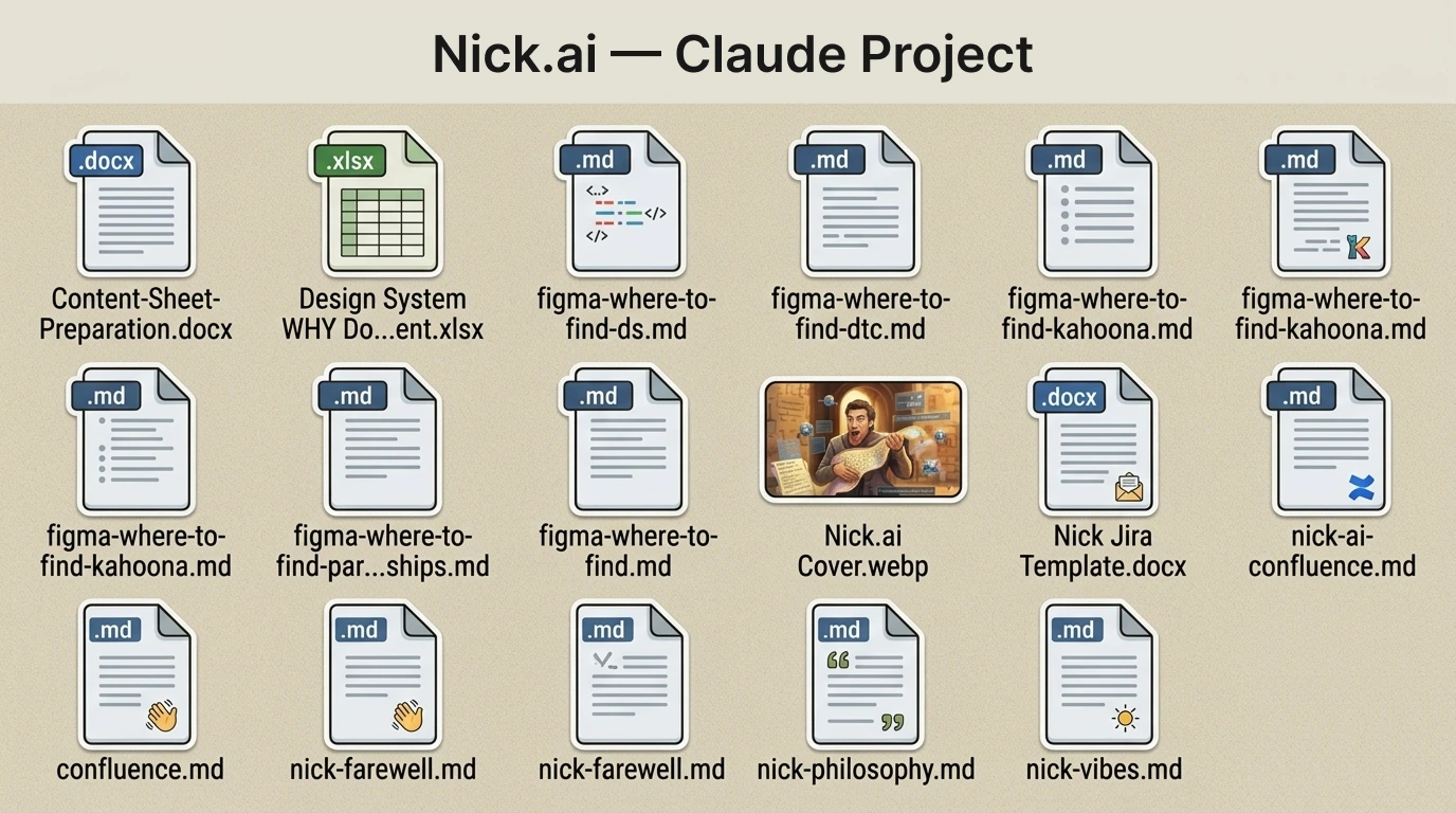
The payoff I'm proudest of: two landing-page templates with content sheets let Marketing spin out 23+ SEO pages across two countries with zero design involvement. And near the end of my time there, I built a Claude project connected to Figma over MCP that generates these sheets at roughly 95% accuracy — a one-to-two-day designer task became nearly free.

What the numbers mean

Less duplicate design work, no re-publish cascades, no interaction guesswork, files that explain themselves, and copy churn designed out of review, QA, and UAT — each change removing a different kind of friction between a design decision and shipped code.
There's a third number, and I mention it carefully. By the time the system matured, the work honestly no longer needed four designers, and we let two mid-level designers go — the hardest call of my time there, and I believe the right one: output held. Both headline numbers were measured internally against pre-change baselines, and I watched them happen. Ask me how they were counted — I enjoy that question.
Prefer it interactive? Open this story on the desktop →

Oona × GCash · Behavioral analysis · Philippines

The funnel mystery that turned out to be pricing

A travel product co-built with GCash was bleeding customers early in its funnel. The hypothesis was confusing UX; the fix was assumed to be design. I started in PostHog instead of Figma — session recordings, funnel data, and a December sales sheet cross-referenced by hand. Families initiated payment at 4.89% while individuals hit 14% — because families were splitting into separate individual purchases to dodge group pricing loading. Not a UX problem. A pricing problem.

The analysis reached the Chief Underwriting Officer and changed the product construct: loading removed for couples and groups, the journey redesigned around Solo, Couple, Family, or Group.

Families 4.89% Individuals 14% payment initiation — same product, same funnel. The "individuals" were the families, splitting up.
Ratios only — the raw funnel values stay confidential.
4.89%families initiating payment
14%individuals initiating payment
2–4×conversions per family drop-off
Read the full case study

The setup

GCash's GInsure marketplace had a problem with travel insurance: too much of it. They didn't want another one on the shelf, so Oona and GCash built something that didn't exist yet — Infinity Travel with Smart Flight Delay, travel insurance and flight delay coverage folded into one product. Under the hood the two are completely different animals: travel insurance wants destinations, dates, and people; flight delay wants a flight number many buyers don't even have yet. Underwriters, Product, and Design whiteboarded our way through it together.

The mystery

Once live, the funnel bled — customers dropping off before they even reached traveller details. The PM's hypothesis was a reasonable one: the flight-delay step, optional but heavily promoted, was confusing people. A design problem, in other words, and design problems get fixed in the UX.

The investigation

I didn't start in Figma. I started in PostHog — session recordings first, then funnel data, then a December sales spreadsheet, cross-referenced by hand in a notebook. Two numbers refused to sit still: journeys that started as a family initiated payment at 4.89%, while individuals initiated at 14% — nearly three times the rate. Why would solo travellers be that much better at buying insurance?

The reveal

It turned out they weren't better at all. When I cross-referenced actual applications, the "better-converting individuals" were the same families — dropped out, then re-entered as separate individual purchases with the same last name, the same destination, and the same dates. One family drop-off was becoming two, three, sometimes four individual conversions. The UX wasn't confusing anyone — the pricing was. Group journeys carried additional loading beyond two people, so families did the math, and split the purchase.

The outcome

The analysis went up to the Chief Underwriting Officer, and the product construct changed: loading removed for couples and groups, and the journey redesigned to ask, simply — Solo, Couple, Family, or Group?

The change was accepted into the joint Oona + GCash roadmap; I moved on before development began. So I won't claim shipped numbers — there are none I witnessed, and I don't borrow outcomes. What I did witness, from the room: at GCash's GInsure Partners' Night in March 2026, the product won Breakthrough Product Excellence and Innovation Excellence, and Oona took Partner of the Year (Gold) — the night's top accolade.
Prefer it interactive? The funnel explorer lives on the desktop →

Oona Insurance · Agent platform · Indonesia + Philippines

Two diverging platforms, unified into one

Kahoona was two codebases drifting apart — mobile-first in Indonesia, desktop-first in the Philippines. I led the unification into a single MUI responsive build: an L1/L2 information architecture and a localized bento dashboard that let one system serve two very different agent populations.

The adoption proof I value most: before design ever touched it, developers built the Admin Panel with the same design DNA. When engineering extends your system without being asked, the system is working. Kahoona grew from a new channel into the fastest-growing origination path in the portfolio — directional only; exact figures are confidential.

The transformation, before to after. Kahoona 2.0 is live on the public site.
Read the full case study

Two countries, two problems

Indonesia and the Philippines ran separate frontend codebases on different frameworks — similar design language on paper, wildly different products in hand. Indonesia's agents were overwhelmingly on mobile, but their dashboard was an old single-column layout that wasn't great on mobile and looked worse on desktop. The Philippines skewed desktop, so its team had decided single-column was good enough. And past the dashboard, every page made up its own rules: sidebars here, none there, different responsiveness, different navigation logic.

The overhaul

The redesign gave both countries one structure everywhere. A collapsible sidebar drives the L1 pages — Dashboard, Policies, Renewals, Network — and anything deeper opens as an L2 focus state on top. You always know where you are, on any screen size. The dashboard became modular — a bento box, essentially: which modules and numbers an agent sees depends on their market and profile, while the design language never changes. And underneath it all, the two codebases became one MUI-powered responsive build — design once, build once, adapt across.

How I know it worked

Three signals, in ascending order of how much they still make me smile. First, Product Managers, Agency Leaders, and developers all gave the redesign strongly positive feedback — rare unanimity for a replatform. Second, the channel data: month after month, the Kahoona slice of policies issued grew while Agency and Broker held comparatively steady. And the best one: the frontend foundation was so clear that developers started building a new module — the Admin Panel — with the same DNA, before design had even started on it.

The channel trend is directional only — exact figures are confidential. The interactive version charts it in proportions, with feature rollouts marked so you can judge the attribution yourself.
Prefer it interactive? The adoption chart lives on the desktop →

Leadership

UX grounded in economics

That lens — sharpened in Prof Roh's product analytics and growth classes at SMU — is how I run design: every design choice is a bet with a cost, and the job of a design leader is to make those bets legible to the business. It's why my flagship work is an operating model, not a screen; why my best investigation ended in a pricing change; and why I measure design in engineering overhead and deployment velocity rather than artifacts produced.

I've led design across two markets and three platforms — direct-to-consumer, agent, and admin — building the team's ways of working so that output survived a headcount halving. I'd rather show you how the kopi gets pulled than tell you it's good.

How I work

Evidence before pixels

PostHog before Figma. Session recordings, funnel data, and spreadsheets cross-referenced by hand before any redesign is proposed.

Never design one extra pixel

Unique states only. Scenario matrices instead of wireflow arrows. The system carries the repetition so designers carry the thinking.

Systems that outlive me

Design Ops built so Marketing self-serves content and engineers extend the system unprompted — adoption is the only metric that matters.

Honest claims only

Every number on this site is one I witnessed, measured against stated baselines. Ask me two follow-ups about any of them — that's the standard.

On my own time

GotJam?Live jam scores + forecasting for the Singapore–Johor crossings. Everyone shows you the jam; GotJam? tells you when to leave. The $1.50 DAMAn AI-labelled, searchable asset library built in under 5 hours for $1.50 in API costs — handed over as a documented repo.